
Component Library
A component is a ready-made interface element with behaviour of its own, sitting in the animation designer’s palette. You place it on a screen, bind it to a variable, and it redraws itself on every data tick. Gauges, tanks, LEDs, toggles, displays and charts are built-in examples.
This screen manages the components installed into the space.
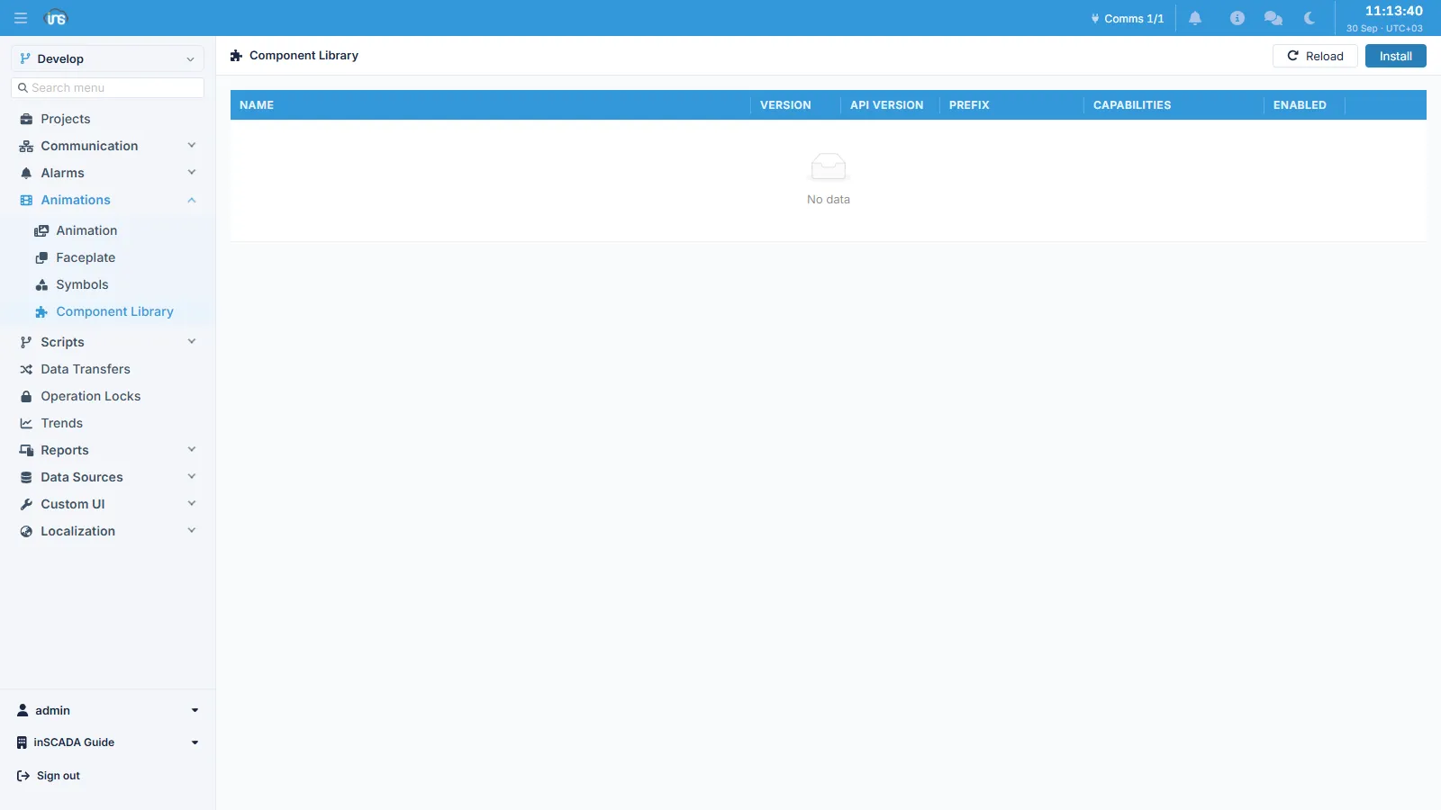
List fields
Section titled “List fields”| Column | Description |
|---|---|
| Name | Component name |
| Version | The component’s own version |
| API Version | The component interface version it targets |
| Prefix | The prefix the component uses for its element names |
| Capabilities | What the component asks to be allowed to do |
| Enabled | Whether it appears in the palette |
Install uploads a new component package; Reload refreshes the list.
The Prefix keeps components from different sources from overwriting each other’s names: every package is registered under its own prefix.
The Enabled flag lets you take a component out of service without deleting it. When you want a component gone from the palette, disabling it first and watching what breaks is safer than deleting it out from under the screens that use it.
Component or Custom HTML
Section titled “Component or Custom HTML”Both put your own content on screen, but they work differently:
| Component | Custom HTML | |
|---|---|---|
| How it renders | Inline in the animation, as SVG | Inside a separate, sandboxed iframe |
| Framework | None — plain JS | Whatever library you like |
| Where its data comes from | A server-side expression | An API bridge injected into the page |
| Where it is used | Placed from the designer palette | As a custom menu or dashboard page |
Put briefly: write a component when you need a readout to sit inside a SCADA screen, and Custom HTML when you are building a page in its own right.
Writing a component
Section titled “Writing a component”Components are distributed as packages; the package manifest declares the component’s parameters and data bindings. Authoring is outside the scope of this screen — this page covers managing the ones already installed.